Thursday 15 December 2011

Shot by Shot Remake of Collateral

This is our Shot by Shot Remake of 'Collateral':
Our version is a bit different from the original. We added music instead of diegetic sounds, the music helps to create a suspenseful atmosphere.  Another way that helped to create a suspenseful atmosphere was that we added slow motion in more shots than the original make. Our remake is black and white to pronounce the lack of emotion portrayed through the characters. The use of black and white also connote a sense of foreboding. We added a fade in in the beginning to start off more dramatically, and also a fade in before the very last shot reinforcing the foreboding atmosphere.

Comparison of the original make and our shot by shot remake:

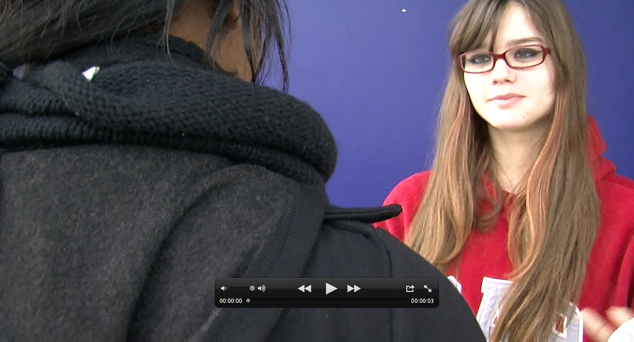
We used the same type of shots that were used in Collateral. This is a close-up which turned out very similarly to Collateral's shot. However, the facial expression isn't exactly the same.


The framing of this shot didn't turn out quite accurate. This was a very difficult shot to make because Rachel and Angel didn't meet in the middle of the framing as they were supposed to.


This is a mid shot of the bags on the floor that is very similar to the original shot but with a slight difference in the angle of the camera.


We end our remake with the same shot that the original ends, an extreme close up of the side frame of the main character with a blurred background - achieved through manual focus.

Shot by Shot Remake editing

Here are some screen shots of the editing process:

1. This is half way through of our editing process to order the shots.


2. We needed to be careful with gaps between the shots. We increased the timeline size to be able to find the gaps and fix them.


3. Here we are changing the speed of the shot to make it slow motion. We reduced it to 85%.


4. We added the music in the timeline. To do this we needed to lock the timeline of the footage and then render it.


5. We added cross fade effect to the sound and the footage shots.


6. To convert the remake in an appropriate format to upload it in the blog we used a program called 'MPEG Streamclip'.

Tuesday 13 December 2011

Dexter's title sequence

I will look at how the opening of Dexter (morning routine title sequence) is effective and anticipates the series.

The opening of Dexter does cover the conventions of a film opening, it presents the production company logo and follows a title sequence while introducing the character and the mood of the series. However what I find most interesting about this title sequence is the way the character and the mood are introduced through camera, miss en scene, sound and editing.
To start off, the title: the font and the colour as well as the blood already anticipate us about what kind of things happens in the series. The title sequence is presented together with Dexter's morning routine. The use of close-ups and extreme close ups makes us feel a bit awkward because it is too close and too detailed, specially when it is showing things such as blood, knives cutting, meat, etc.
These props makes us associate with murder, which is a good way to introduce the psychopath character and the psychotic mood of the series. The music in the background makes it all seem as a normal usual routine that happens everyday, what is a bit creepy because his morning routine is associated with killing. Other sounds effects of suspense help to create this murder atmosphere like for example when we get a close up of the knife cutting the meat.
Together with the close ups we get very accurately the diegetic sounds of what he is doing, what makes us feel a bit uncomfortable because they are not very pleasant, as well as the extreme close-ups are not very pleasant.

At the beginning of the opening, the editing is slower, emphasising this sense of awkwardness and creating tension. More towards the ending, the editing gets faster creating pace to this routine, making it more thrilling, also anticipating about the plot and the character. I think this is a very effective opening that is engaging and creates intrigue, as it anticipates some things about the plot and character but still leave us to want to know what happens.

Sunday 11 December 2011

Health&Safety tutorial cont'd

We also had to sign a form regarding the health and safety to show we knew how to use the camera equipment safely. An image is posted below:

'Watching' Documentary part 2

Directors want the adventure of the film to start as soon as possible, as well as the audience wants it. As part of the audience I believe that sometimes, boring title sequences may make you lose your attention to the opening of the film. The credits and title sequence became stealthy or leaped, to get at the audience's imagination before the title sequence. Kyle Cooper's title sequence to the film 'Seven' worked effectively because it starts together with the film and helps to create the mood/tone of the film. His title sequence gets the audience ready for what happens in the film, it becomes the first scene of the movie and introducers the nature of the character, foreshadowing things that will happen in the film.

Studios believe that the audience needs a formal title page before they understand the film, which prepares them to the understanding. Orson Welles wanted his film opening of 'A Touch of Evil' without the credits and title sequence, he wanted the audience to get into the story without the time to prepare themselves. However, Universal Studios didn't want to lose the conventions of a film opening, and therefore Orson Welles' intended effect was lost. By the opening of 'A Touch Of Evil', Welles shows that he could control the film making as well as the audience. The fluency of the first sequence makes the audience forget that they are watching the film, and then they get blown away with an unexpected explosion.
In 'Casino', Martin Scorsese does a similar thing with his opening, but in an accelerated way. In just a few seconds he gets the audience involved with the film and then blow them away with an unexpected explosion that leads to the credits. It uses the 'favourite trick of Film Noir', which is starting the film with its ending and leaving the audience wondering what has happened that lead to this.

Saturday 10 December 2011

'Watching' Documentary

"Films need to seduce their audience into long term commitment. While there are many types of seduction, the temptation to go for instant arousal is almost irresistible."
I believe that when Thomas Sutcliffe says this, he means that what makes a good film is how well the film is able to engage its audience, and that mostly this engagement comes from the beginning of the film. In response to that, as part of the audience, I agree that the film must engage the audience from the beginning. If I start watching a film that the beginning is so terribly boring I don't even bother watching the rest of it. As he said in the documentary, the darkness and the silence of the cinema is when the audience is waiting anxiously for the film to start, the film must attend the audience's expectations of excitement. I think the beginning must create intrigue and the engagement must be kept up throughout the whole film.

Jean Jacques Beineix suggests problems with instant arousal. The consumers sometimes want everything instantaneously, the feelings, the emotions, but he believes that these can be grown throughout. If the audience is aroused at the very beginning, there is a risk in not being able to arouse the audience anymore in the rest of the film. 
"A good beginning must make the audience feel that it doesn't know nearly enough yet, and at the same time make sure that it doesn't know too little."
I think what is meant by that is that the beginning must have this balance of information because it shouldn't say too little that the audience doesn't understand about it and feel so unclear that they cannot understand the rest of the film. However, it shouldn't say too much, making the audience feel confident enough about the rest of the film so that it loses engagement. The beginning needs to create intrigue, so that the audience doesn't know clearly what is happening, but they want to find out and they will find out later on. 

Film openings are important not only because it establishes characters and plot, but also because it establishes the tone of the film, and therefore it instructs us in how we should watch the film and how are we going to respond to it. Stanley Kaffmann explains that the reason why classic openings with establishing shots work well not only because it is establishing the setting, the character's position, but also showing that everything (the state of the world) is in order, in equilibrium. Like Todorov's theory of narrative structure suggests that the a film begins with an equilibrium which later on will be disrupted. The classic opening establishes this equilibrium. 

Previous experience

As I did Media Studies GCSE, part of our coursework was to produce a trailer for a horror film. This is my trailer, the quality of the cameras wasn't professional, but the trailer covers everything we learned about filming and codes and conventions.
I think that this previous project might help me with our thriller if I can apply all that I learned :)
I did most of the editing of the trailer and I used the iMovie so I have an idea of how to edit, but I will need to learn how to use Final Cut Pro. Here are some of the shots I took:


Thursday 8 December 2011

Health and Safety tutorial

On Monday's lesson we had our Health and Safety tutorial and we were introduced to the equipment we will use in the project. :)
We will be using professional recording cameras in order to achieve a professional standard quality to our thriller. The camera is a JVC GY-HM100, the smallest professional format camcorder. It is very practical because it is small and we can carry with us with ease, and it is less exposed to the risk of falling as it isn't heavy. We must be very careful when working with the cameras, therefore we had a Health & Safety lesson to avoid major problems when using the camera. Our teachers watched each one of us doing the following:

  •  Inserting and removing the sim card correctly.
  • Inserting and removing the battery correctly.
  • Opening up and closing down the tripod correctly.
  • Inserting and removing the camera from the tripod.

We also were told how to use the camera buttons (how to turn it on/off, how to zoom in/out, how to change from auto focus to manual focus, etc) and a few rules + advice to when we are using the camera.

  •  We mustn't touch the lens, because if they get damaged, it will ruin our footage and lens are expensive.
  •  We must ensure that the camera is tightly held on the tripod.
  •  We must hold it accurately and safely.
  •  We must leave the camera always in safe places.
  •  We mustn't expose it to rain or liquids, or anything that might damage the camera.
  •  And of course, we must always leave our Media ID cards to borrow the camera, and take it back as long as we gave all the equipment back.


The Tripod

The tripod legs can be extended twice. We should first extend the legs, and afterwards we should open it. We must ensure that the legs are completely open and extended, there is a green bubble that shows whether the tripod is levelled correctly or not. It also extends its top part, it reaches a very high level, really appropriate for high angle shots. Tripods are really helpful to get perfectly still shots or reduce shaking, levelling the shots correctly, and getting good angles.


The battery & sim card
The battery can record approximately 120 minutes, if we are going out for long we should always have a second battery available. The memory card in a full high quality can support 1 hour of filming, what should be enough to a 3 minute opening, but in case we need another one we can get it. Also we need to be careful to not delete or lose any work from our memory cards.

Collateral Storyboard

In today's lesson we were learning how to create a storyboard. The storyboard helps us to start thinking visually about the shots we want to create. This is our storyboard plan for a scene of the film 'Collateral':

We noticed that in this scene there were lots of close-ups and two shots. Also the shots were mainly focusing in the key character of the shot, so the character was on focus and everything else was blurry.

Wednesday 7 December 2011

Donnie Darko's opening


The opening of Donnie Darko contains many coded and conventions of film openings. We are introduced to the logo of the production company and distribution company:

Then we have the title sequence, written in white with a black background and followed with a storm sound. The black background and the storm sound help to create a dark and suspicious atmosphere.

This atmosphere is confirmed by the very first shot of the film. The shot is introduced by a fade in, helping to create suspense, and it is a pan which starts from a very dark place with trees. The pan follows up showing mountains, it is a establishing shot showing the set and establishing the scene. The birds singing in the background and the storm sounds make it seem a very quiet place and together with the mountains, in the middle of nowhere. 
A creepy tune starts to play, making the mood even darker and more suspicious, together with the camera tracking in the direction of the boy lying on the floor. This makes it looks like he is dead. The lighting is not very high, although it isn't totally dark, it isn't bright. This low light increases the tension of the scene, as well as the fact that the street is completely empty, and the tune is a bit quiet, making a mysterious mood and suggesting that something is wrong. 
Surprisingly, the closer we get to the body, the boy starts to move, contradicting out first thoughts and keeping us engaged with this thrilling beginning. A piano starts playing in the background, we then get a mid-shot introducing us the main character. The piano sounds melancholic and sad, the boy's facial expression as well. The background is empty making him seem alone. These create a gloomy mood to the scene. 

When he gets up and we have a mid-shot of him and the mountains in the background it really shows that he is alone in the middle of nowhere. He smiles, but the smile seems a bit psychotic as the sad tune starts to get a bit creepier. We then are introduced to the film title in the beautiful shot of the mountains and with the sun in the background. The sunlight gets very bright and takes the whole frame taking us to a new scene. 

I really liked the opening of the film and how the codes and conventions were used. The first  2 minutes really create a gloomy mood and introduce the genre of the film as a thriller. I liked the camera work, it helped to create suspense with the slow movements and slowly letting us know the character. In addition, the setting makes us wonder what he is doing there alone, therefore it is engaging and it sets a plot.

shot types practice

This is a median close up taken against the window. Usually when shots are taken next to the window the lighting affects the shot making it inaccurate and darkening the subject. However this shot lighting is not that bad.  The framing is good because it adheres to the rule of thirds and the top of the head is cut.

This was an above the shoulder clip using the rule of thirds. The framing is accurate as it doesn't spare any space. However the lighting here seems to be way too bright, perhaps because thee camera is positioned in a place where the light comes from the window and makes them too bright in front of the camera.

This is an example of a very bad shot. There is a lot of space around Rachel's head and it doesn't follow the rule of thirds.

This s an example of a nice mid shot where there isn't much spare space in the framing and again follows the rule of thirds. The top of the head cut is also a good indicator that the framing is accurate.

This is another example of a bad shot. The eyeliner is lower than the rule of thirds, there is too much spare space around. Also, as it taken next to the window, this is an example of a bad lighting. The background (the window) is rather bright and Rachel is too dark. 

This is a tight framed close up on the foot, about to go down to the ground.

We could have don an extreme close up on the feet and the phone, as that is an important prop it is getting stepped on.
This is an example of a good extreme close up. The face is centralised so there aren't any spare space. The framing is also accurate because it follows the rule of thirds. Here is a good example of lightning, as the shot is taken from the opposite side to the window. 

"The rule of thirds proposes that an image should be imagined as divided into nine equal parts by two equally-spaced horizontal lines and two equally-spaced vertical lines, and that important compositional elements should be placed along these lines or their intersections."